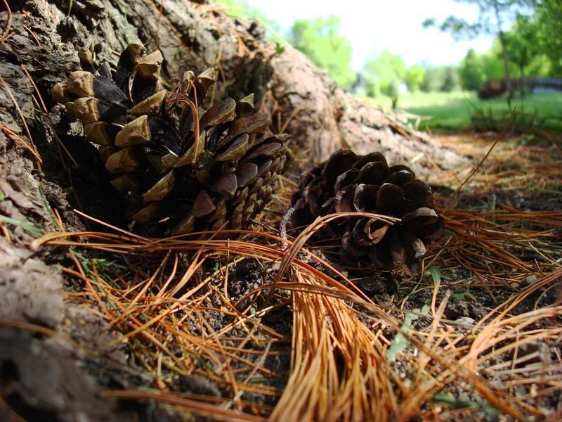
Adjusted levels to increase blacks and grays, increase hue, increased contrast and brightness
Adjusted levels to increase blacks, increased saturation, increased contrast, decreased brightness
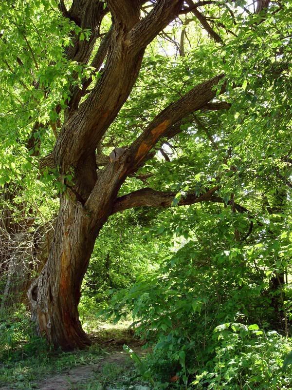
adjusted levels to increase blacks and decrease whites and increase grays, increased hue, sharpen filter, increase contrast, decrease brightness
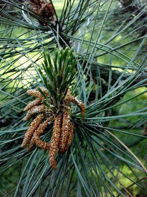
Adjusted levels to increase blacks and grays, increased hue, decreased brightness, increased contrast
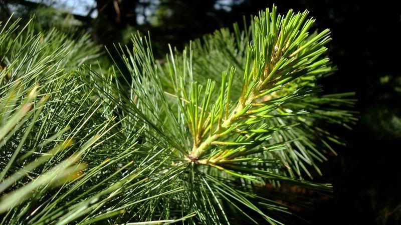
Adjusted levels to increase blacks and increase grays, increased hue, decreased brightness, increased contrast
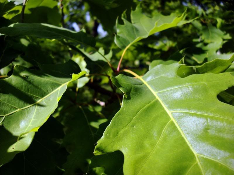
 Adjusted levels to increase blacks, increased saturation, increased contrast, decreased brightness
 adjusted levels to increase blacks and decrease whites and increase grays, increased hue, sharpen filter, increase contrast, decrease brightness
 Adjusted levels to increase blacks and grays, increased hue, decreased brightness, increased contrast
 Adjusted levels to increase blacks and increase grays, increased hue, decreased brightness, increased contrast
2 comments:
Good theme, Tina.
Tina,
Good work with the artistic side of your pics. Look forward to seeing some more in the future. Here are some comments per pic:
1. Good focus on pine cones. I like the up close and personal feel. Great depth of feel. You got this by moving your cameta very close to the subject matter. Check out the Powerpoint in the "Course Documents" for more information about DOF.
2. Tree. Wonderful! Good composition. Crop a little closer to lose some sky, ground, and under brush. The picture should not look like you simply stopped and took a picture. The tree is the subject! Eliminate some brush on the right side.
3. Nice pine cone. Move slightly one way or the other to capitalize on the rule of thirds. Heavy objects to the left. Two objects in pic are boring - select one or three (odd numbers work better)
4. Bright but no real center of interest.
5. Good contrast and color of leaves. Nice close up. Not sure what the center of attention is.
Good work for your first lab assignment.
Post a Comment