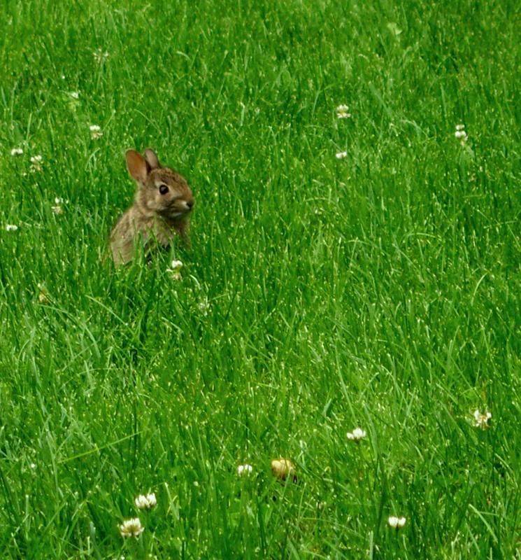
This picture was cropped and then i used the hue saturation and the bightness/contrast to adjust the grass color aroud the baby bunny. This is a medium quality image of 2048.
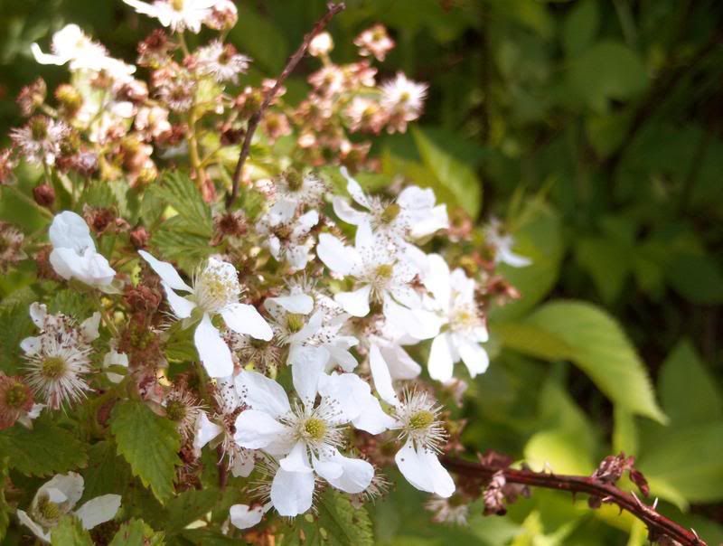
This picture was cropped and then I adjusted some of the colors using the color scale. My low image quality is 1280.
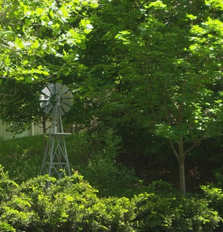
This picute was cropped and i used the brightness/contrast to adjust the colors. I also hue saturation to adjust colors on the trees. My high image quality is 3264.
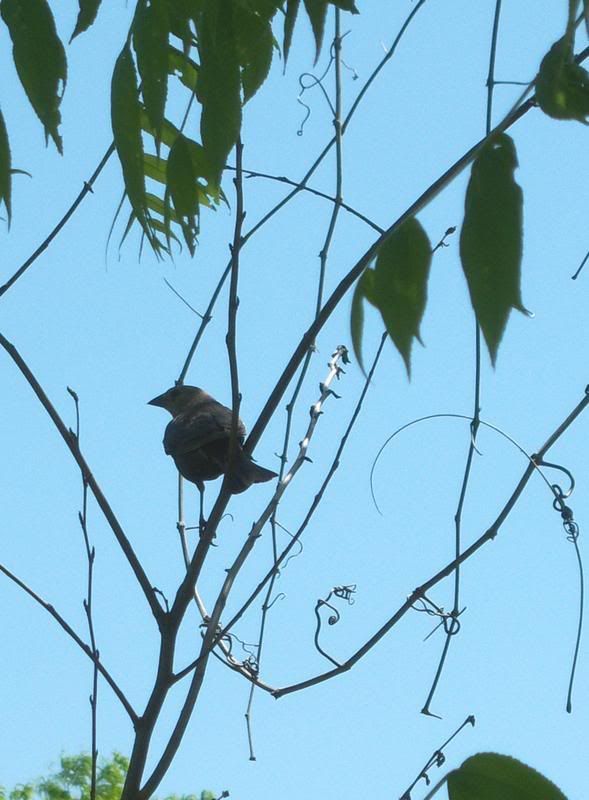
This picture was cropped and then I used the brightness/contrast to adjust the colors. MY meduium image quality is 2048.
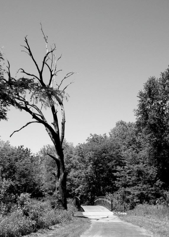
I cropped the picture size and added a gray scale. I also played with the brightness/contrast for the color
 This picture was cropped and then I adjusted some of the colors using the color scale. My low image quality is 1280.
 This picute was cropped and i used the brightness/contrast to adjust the colors. I also hue saturation to adjust colors on the trees. My high image quality is 3264.
 This picture was cropped and then I used the brightness/contrast to adjust the colors. MY meduium image quality is 2048.
1 comment:
Katie,
Good work on this first lab assignment. I like the eye that you have for photography. Nice theme to all your pics. Here are some art comments per each pic:
1. Great rule of thirds. Rabbit is at the top 1/3rd cross points. Center of interst is very small compared to the rest of the field of green. Zoom in or crop out most of the green.
2. Fairly good composition on the flower. I would suggest your move closer in (either zoom with the camer, walk closer, or crop and enlarge in PS.) to the subject matter. Good contrast between the white and greens.
3. This picture is confusing to me. Not that I don't understand it but that there are two issues coming into play. One is that windmills are usually tall and overpower other objects around them. This one does not. So it is a miniature one. OK. The other issue is that this windmill is in someone's backyard (house is visible in background). So it gets lost in the field of trees. So do you want viewers to look at the small windmill or the many trees. always best to have one clearly defined center of interest.
4. I like the fact that you were able to get so close to the bird before it took flight. It is off center in that it is looking off the page. Give it some room to see and to fly. Moving it to the right side 1/3 point would be more pleasing. Also its color and detail are lost due to underexposure.
5. I like the choice of B&W which give the bridge and tree a dated feel. You could move in quite a bit and lose some of the clutter on the right. Tree branches in the froreground are confusing. The picture is the tree and the bridge. Try to get these two to play off wach other. I like the way you placed the heavy object (tree) to the left of the picture. However, it looks like you simply stopped walking and took a picture at face level. Consider changing angles (get low down on the ground and shoot up) for greater impact.
Nice overall first effort.
Post a Comment